


Okay, so this problem might not affect everybody, but it's affected me pretty much since I've begun in earnest the pursuit of mastery of Unreal Engine 4, and it is this:
When attempting a "stylized" look in UE4 (particularly using textures that require little if any lighting beyond just needing to be visible), very often do any of the colors of the textures I use ever look right, no matter how much I tweak the lighting or post-processing. They always look either faded, de-saturated, blown-out, or some combination of all of those.
I'll give you an example. In my previous post, look at the screenshots of "Kiki Banana 64". Then go to the post before that and scroll down to "The Voyage of Kiki Banana" (the 2D platformer), and look at the raw animations of the character. Do you notice any discrepancies between her colors (particularly her skin tone) in the animations and those in the screenshots?

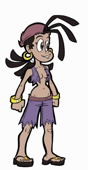
Notice how pasty pale she looks compared to her actual tanned skin tone in the 2D animation? Very unbecoming of a near-topless pirate girl always exposed to the sun. And I used that exact same color for her 3D textures, and yet they look this different.
In fact, the 2D platformer was so bad that I had to run the game in unlit mode because otherwise the game looked like... well....

And I swear, no amount of messing with lighting, shading, or post-processing effects so far yielded any satisfactory results...
Until I discovered Tone Curve Amount, and by complete freakin' accident no less...

Tone Curve Amount is part of post-processing, under Color Grading -> Misc.
As a non-expert, dare I say novice, at UE4 and computer graphics in general, I don't know what tone curve even means in this context. However, I have discovered that, by cranking this value way down, to about .2 or so, the colors of my textures become far closer to how I originally intended them to look.
Observe...

With a full Tone Curve amount of 1 - washed out sand, wrong-colored purplish cliffs, volcano's too dark, etc... and this is with other Color Grading tweaks.

With next to no Tone Curve - more vibrant sand, cliff colors are more accurate (even if you can't really tell in this particular shot), richer blues, more visible volcano, etc.

*oops, that's supposed to be "texture"

These changes may be a little subtle and don't come across super clearly in these still screenshots, but in motion it looks so much nicer, and closer to my original vision.
Now, being the novice that I am (as of this blog post), I can't say for sure if this is a permanent fix, or that other problems might arise from implementing this, but for now, it seems to work just fine.
So, anyway, if you're ever having trouble getting your colors in Unreal Engine 4 to look closer to how they actually look, give this a shot. It might just work <:P|


